Making facts and numbers look good is more than just making it more entertaining to look at. When you turn information into infographics, your information has a greater impact and can be more clearly understood. Infographics also help when you don’t have specific video or pictures to include in your story.
24 Tools for Journalists to Explore
https://twitter.com/JNetAbrahamsen/status/904702632744427520
Here’s a great website that does a wonderful job of using infographics for news: https://www.good.is/infographics
Canva
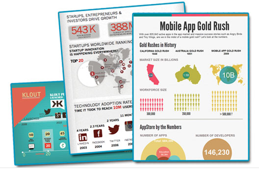
Canva is a great tool to create infographics, posters, and slides for presentations. I suggest you check out their design school page to get inspired and find exactly what you’re looking for. Here’s a tutorial for beginners:
Pew Research Center
The Pew Research Center produces mass amounts of data. It turns much of that data into infographics and videos. Here’s an explainer of how random sampling works:
How can you use data as part of your research process? This next video shows you how to navigate one of the Center’s massive studies on America’s religious landscape.
News organizations rely on polls to gauge public opinion, but sometimes they’re wrong. Check out this next video that explains why polls did not predict the outcome of the 2016 presidential election.
Here’s one last video from the Pew Research Center that shows how you can combine data and multimedia to tell a compelling and informative story.
Leave a Reply